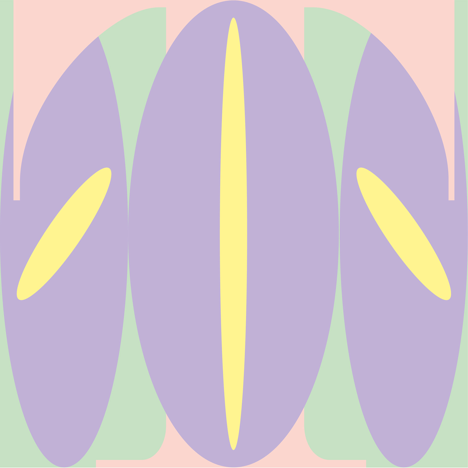
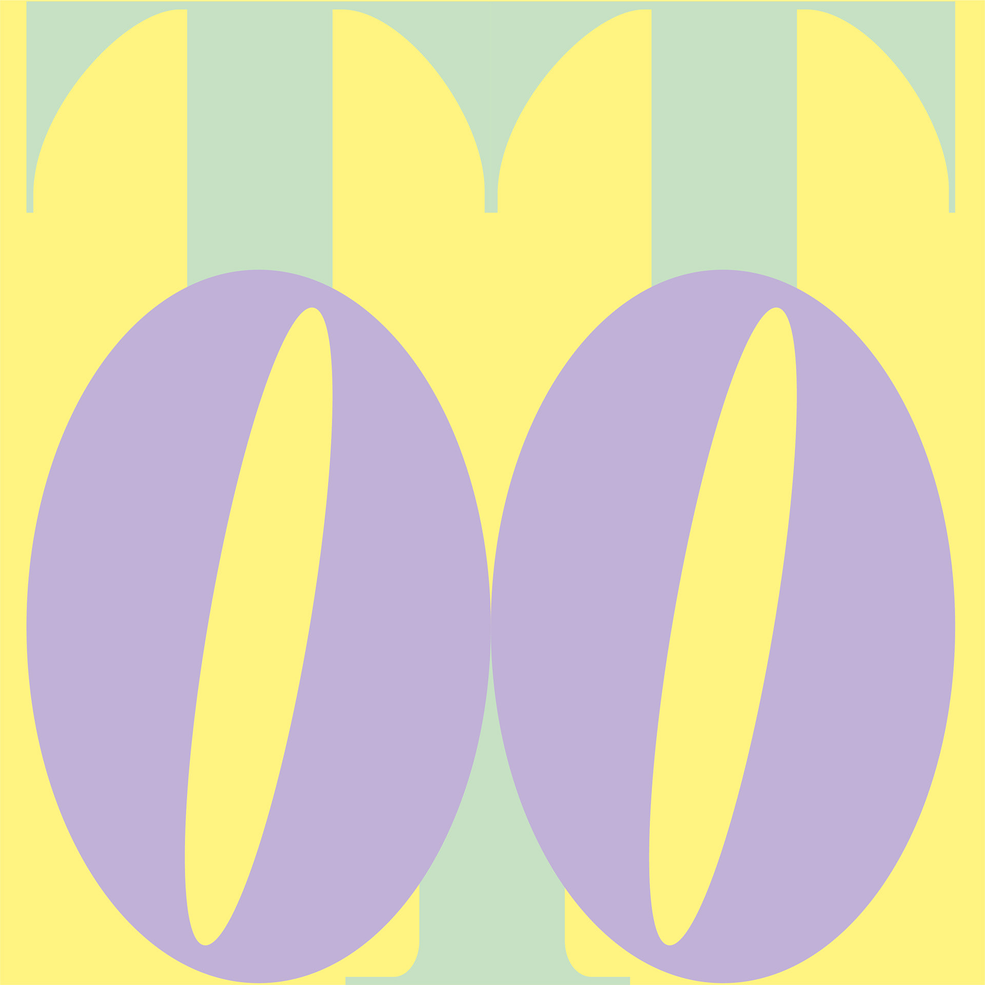
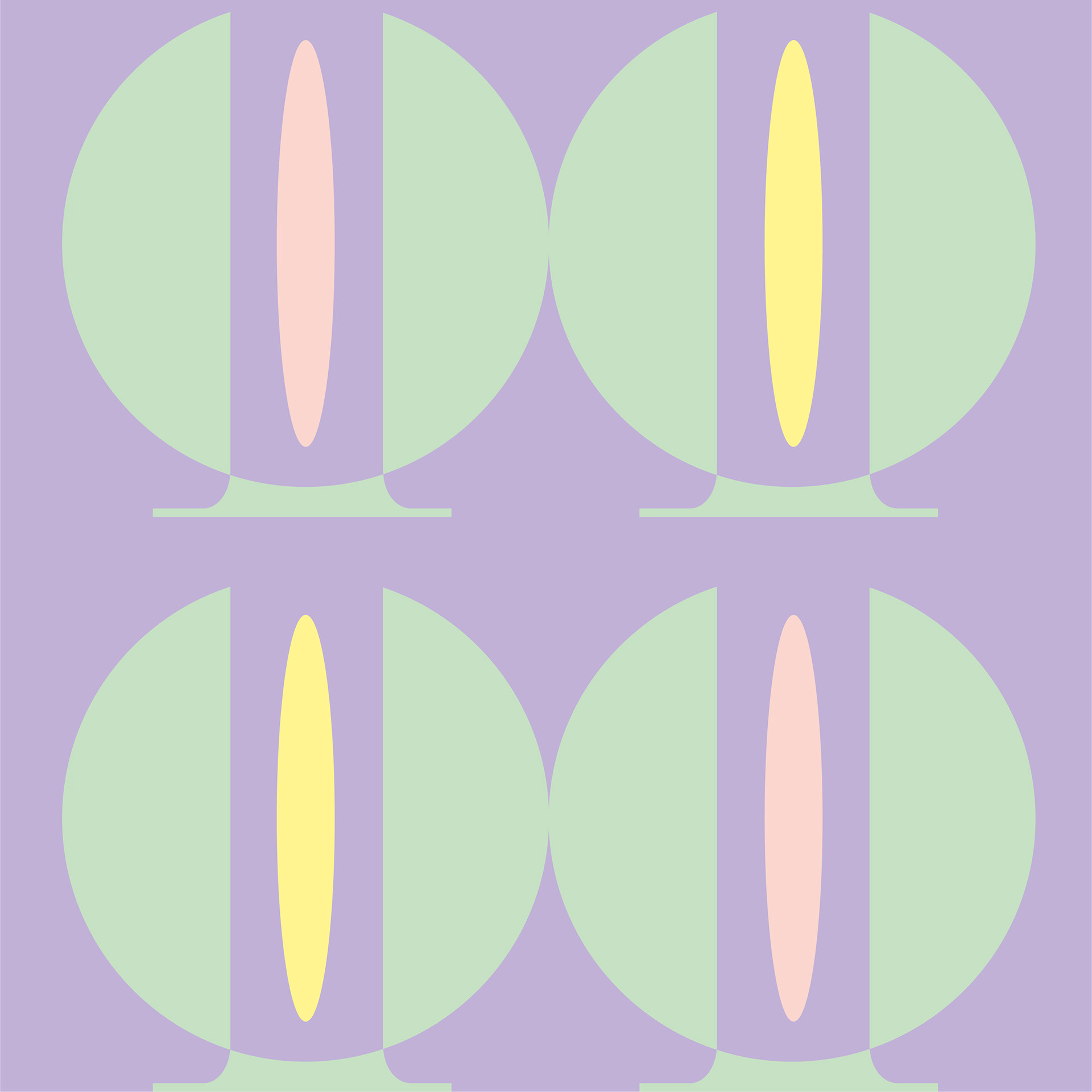
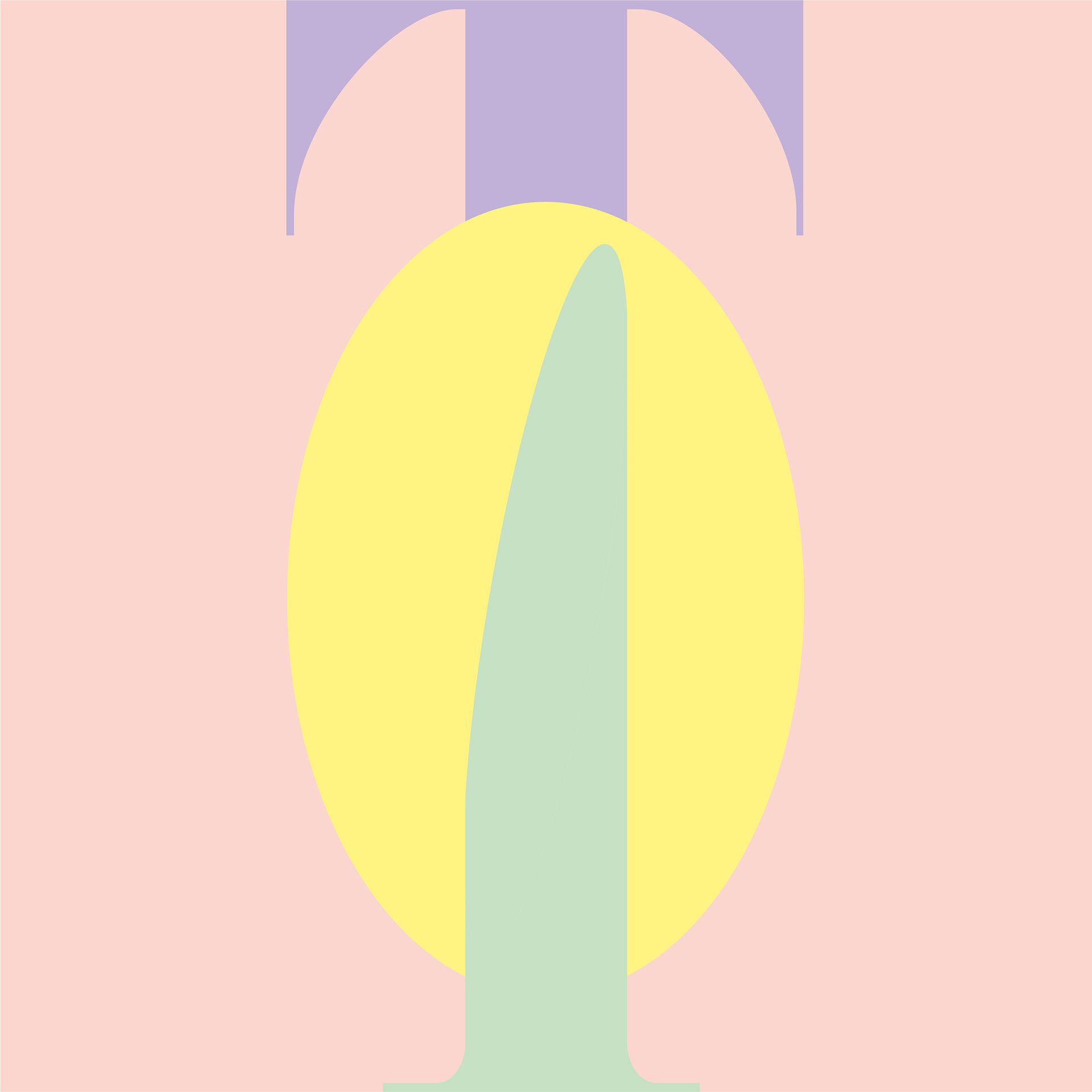
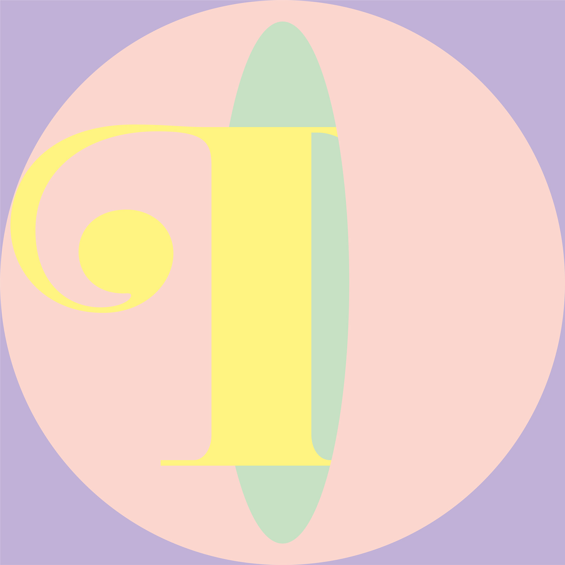
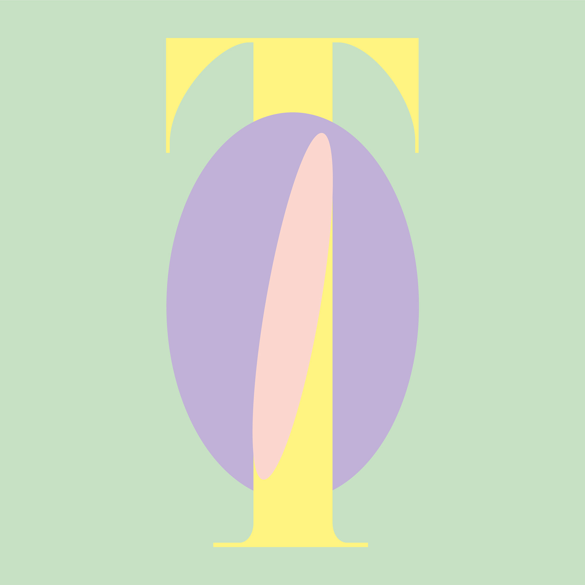
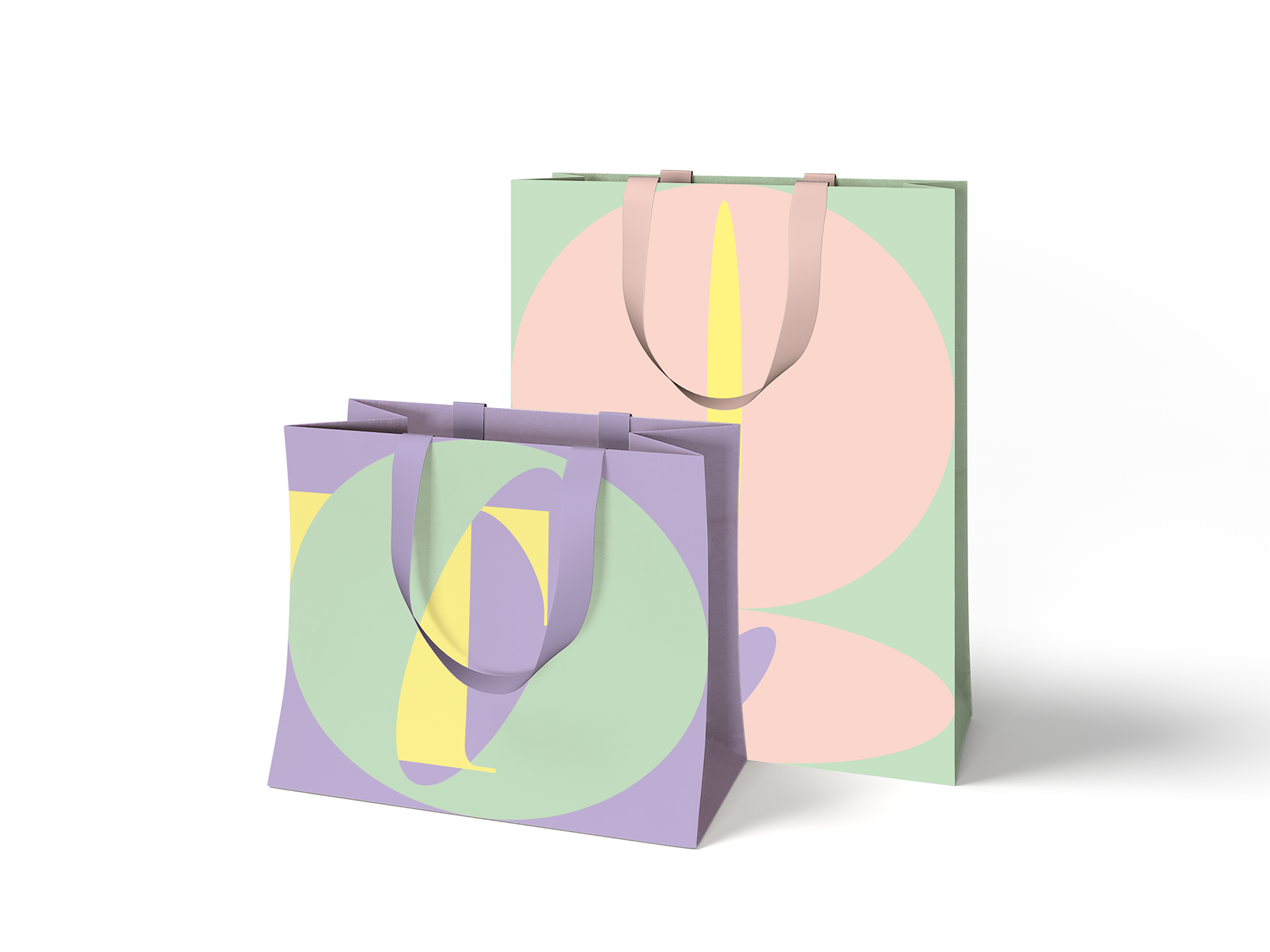
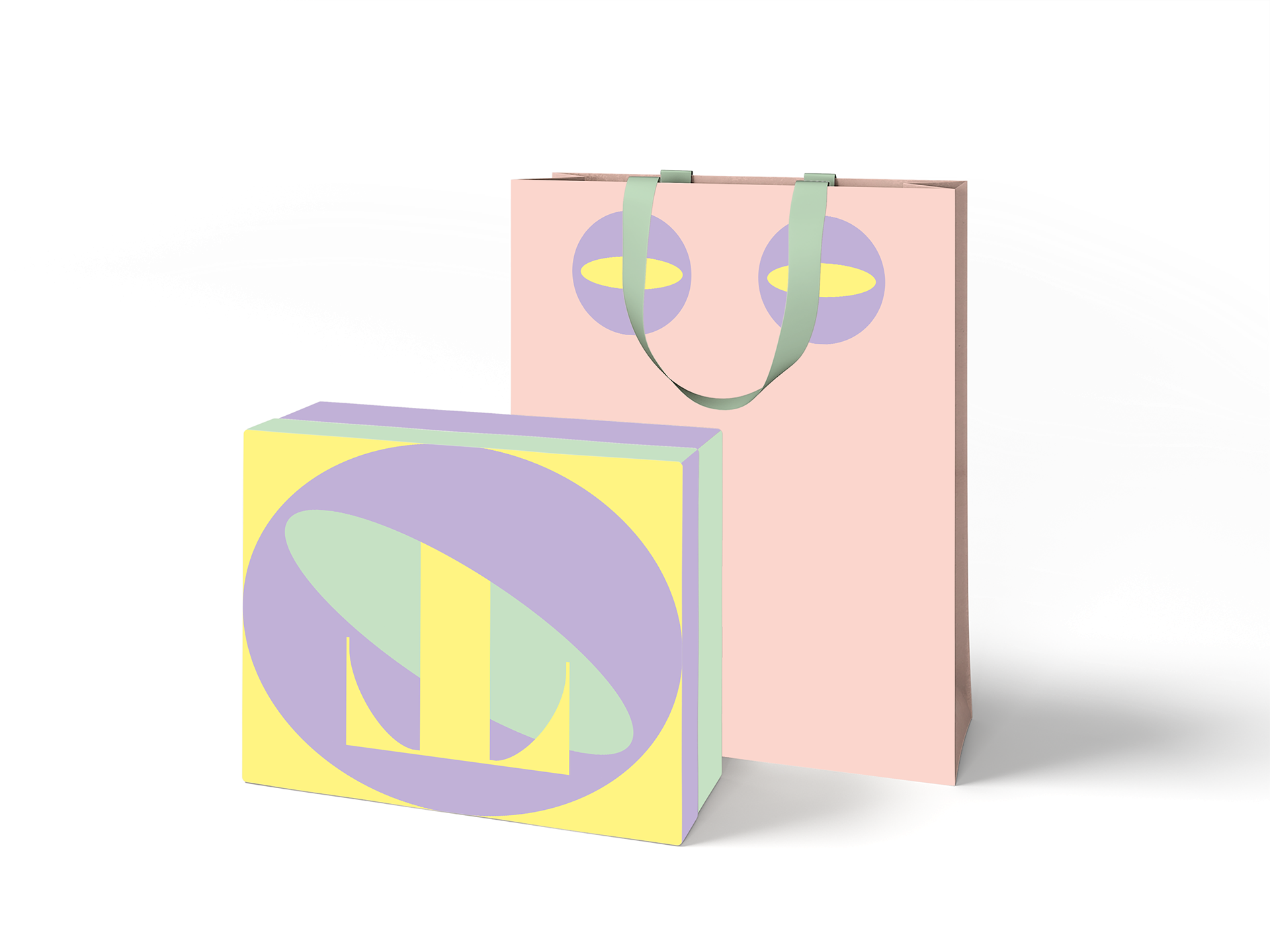
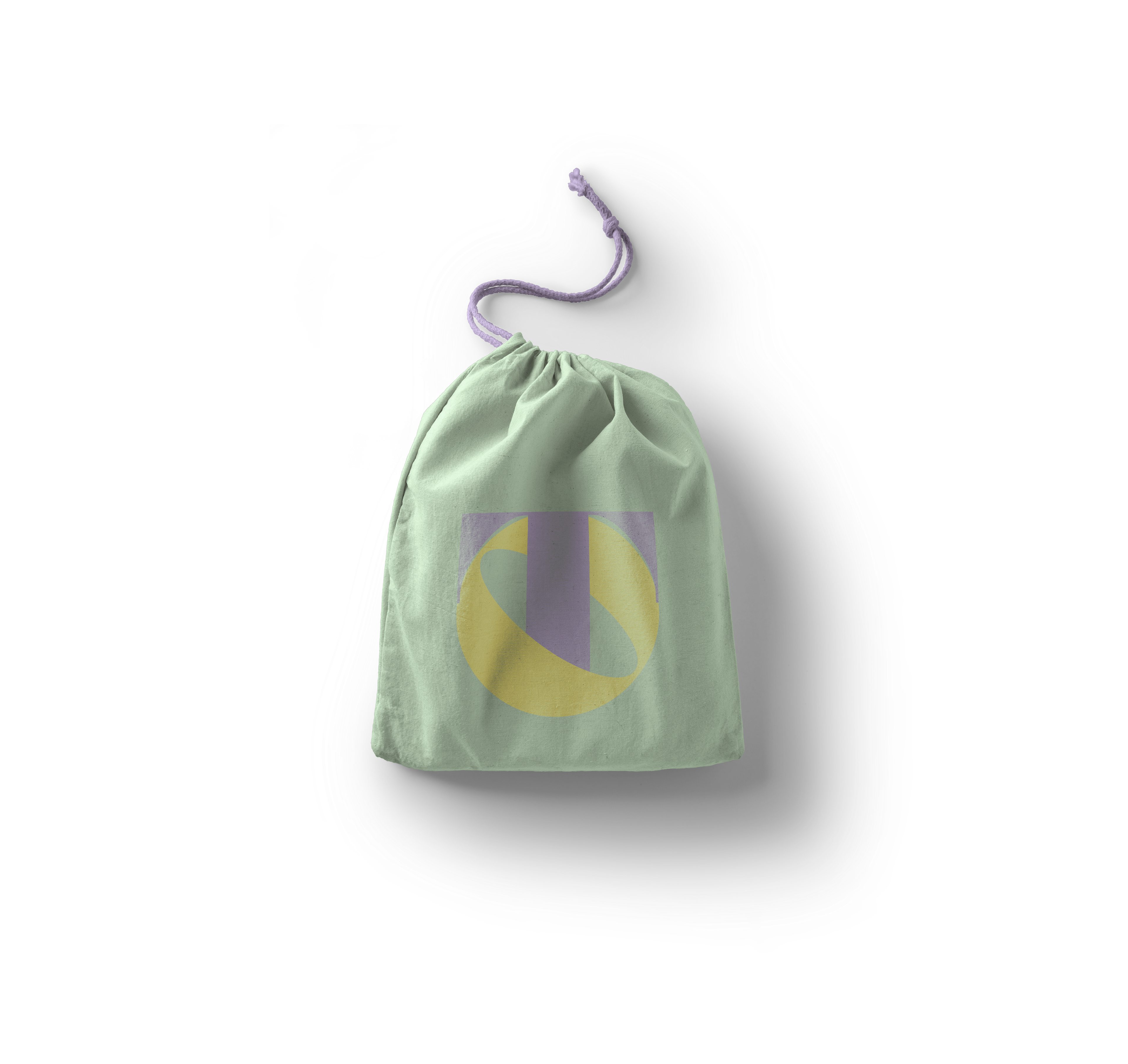
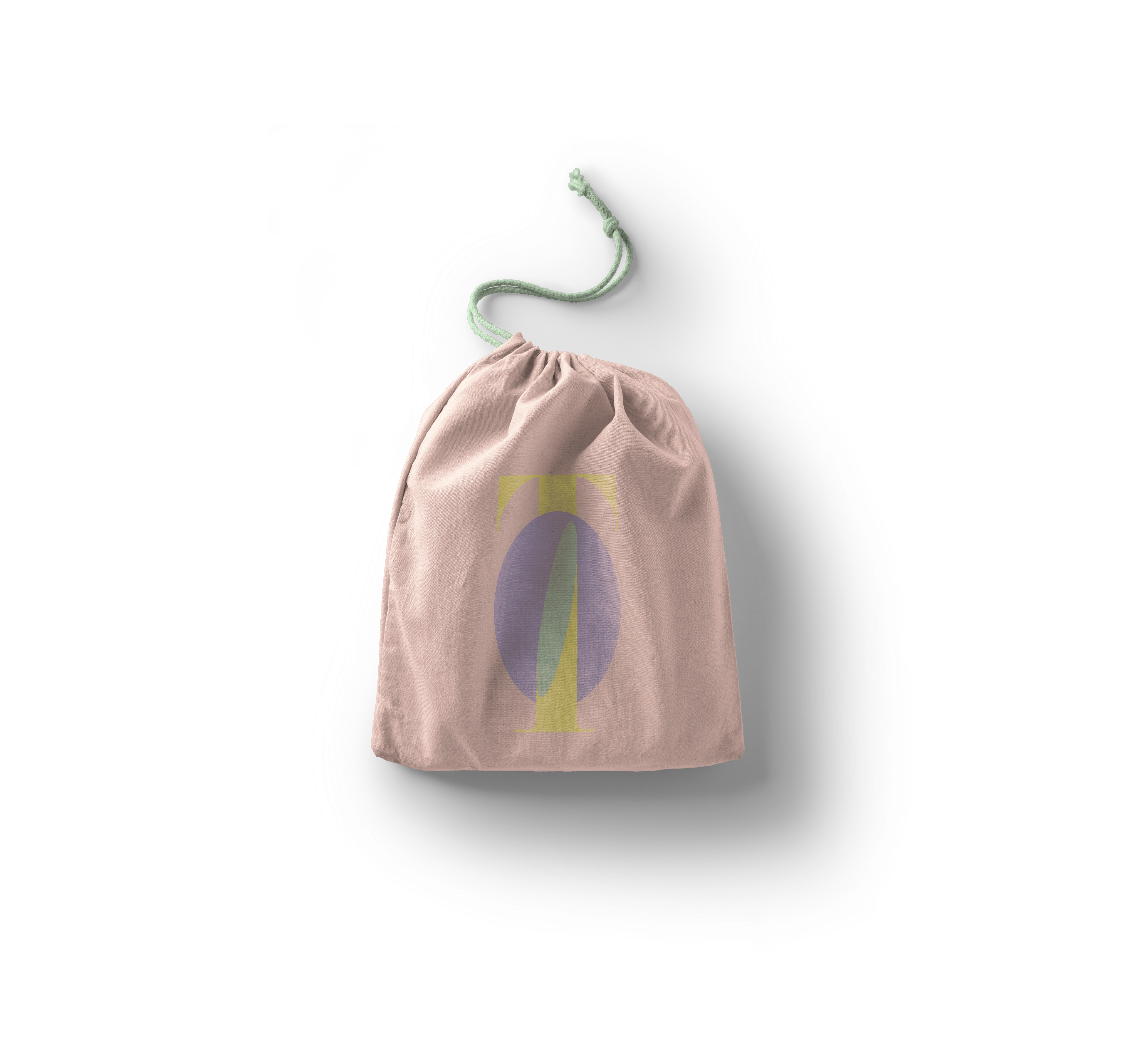
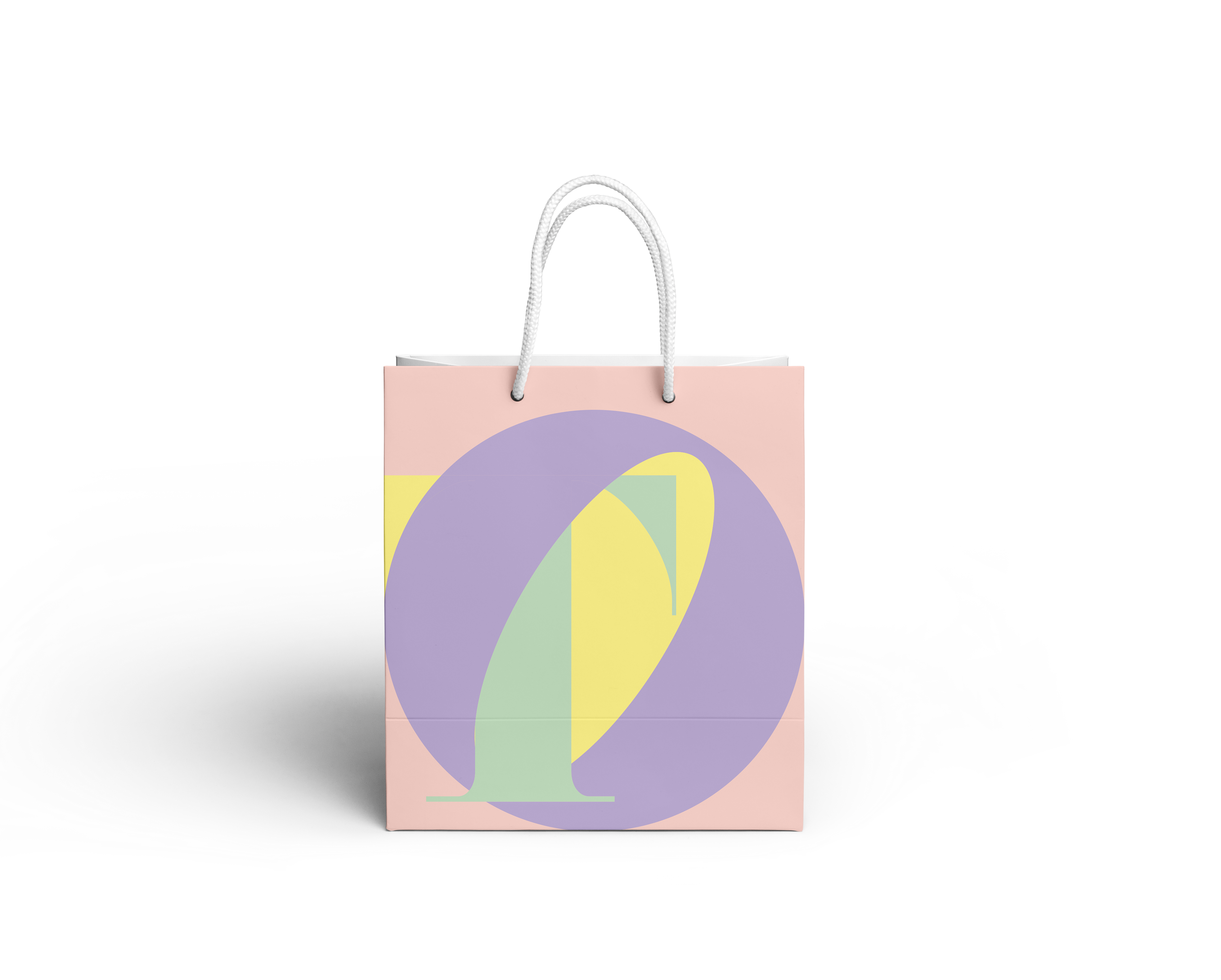
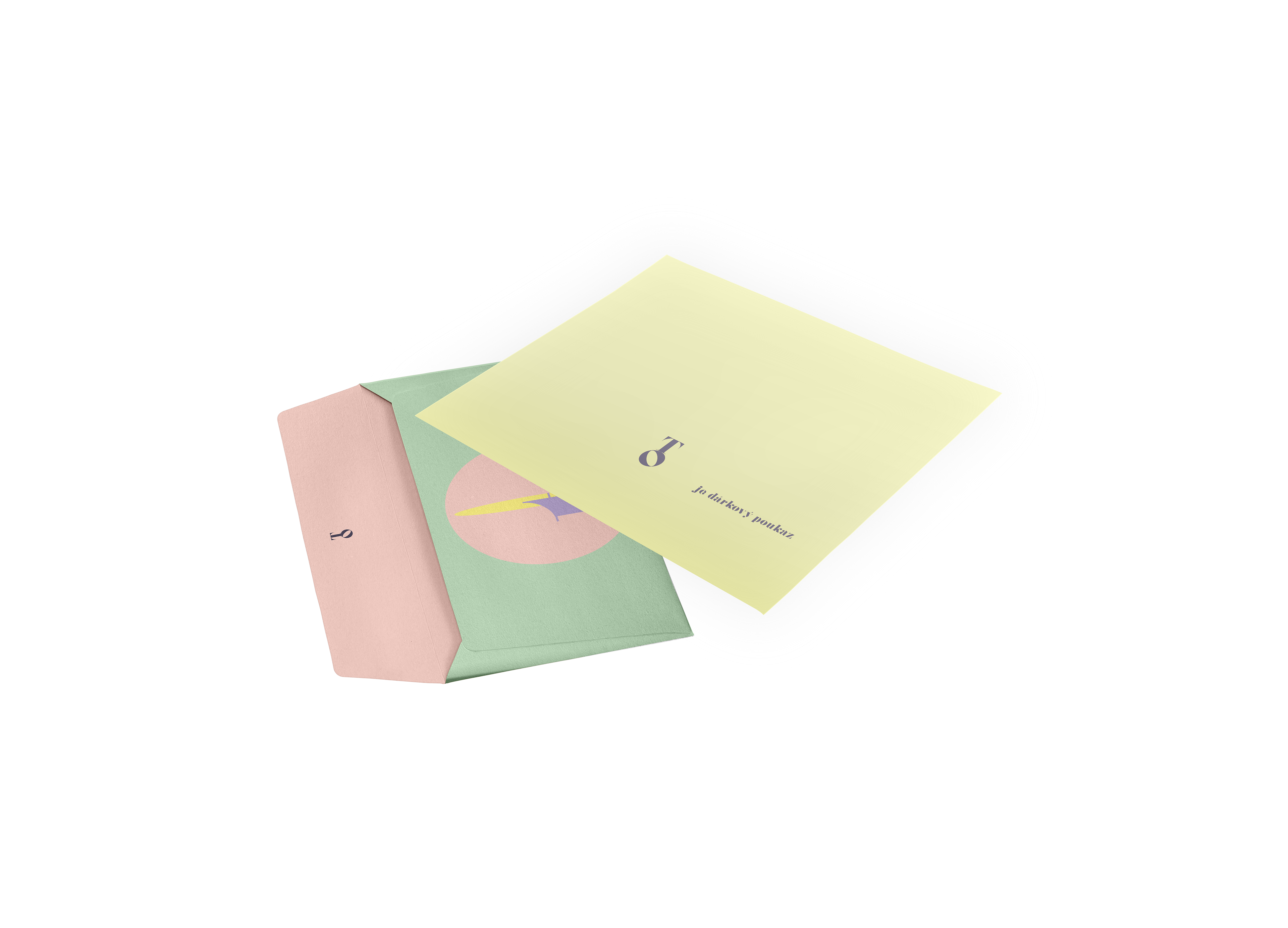
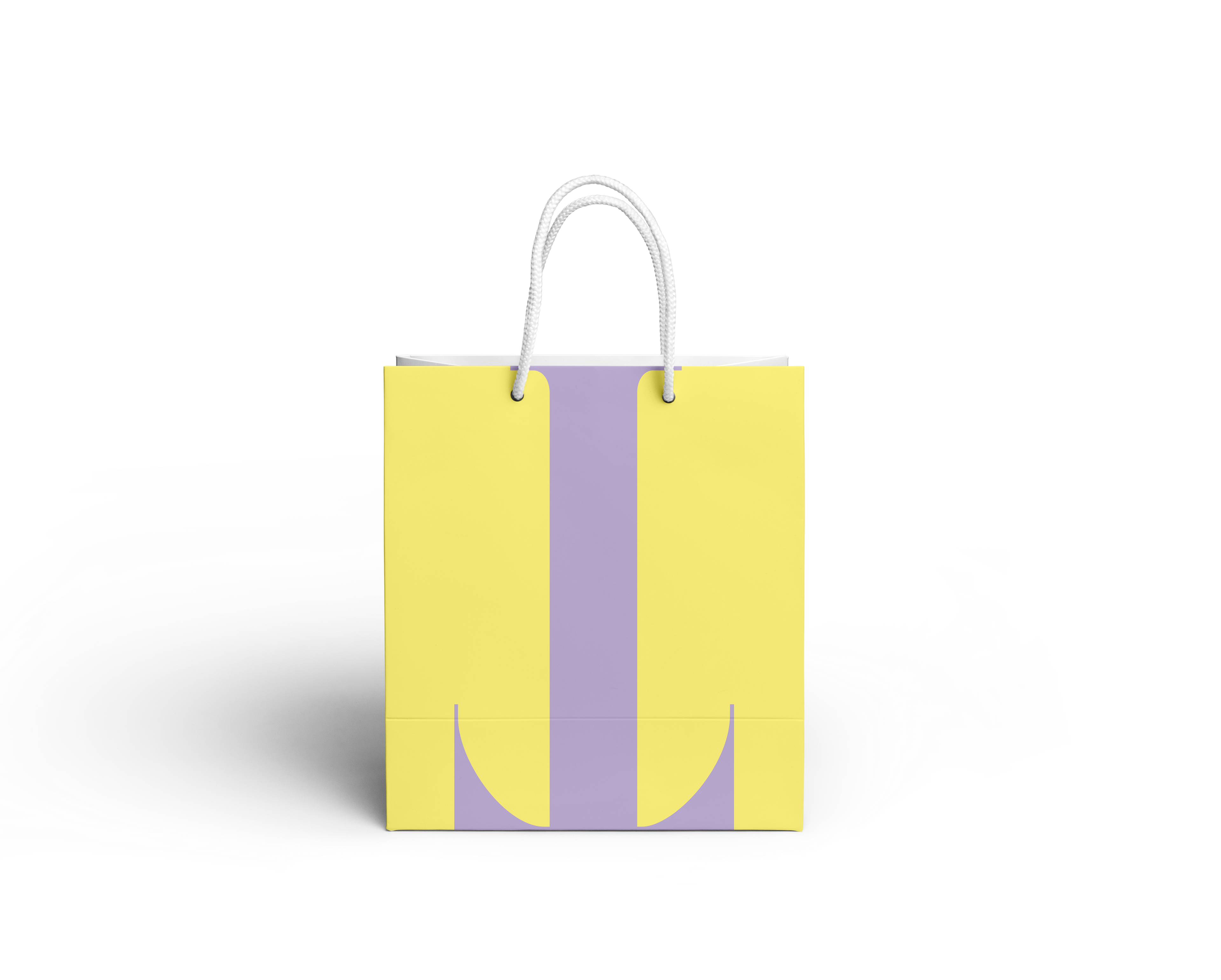
Design for a fictional sex shop at the most fancy shopping street in Prague.
The assignment we were given at the uni was compounded of two parts – we were told to pick up some typefaces that we like, but we did not know what we will be asked to use them for. After a long workshop dedicated to typography and how to pick up typefaces and how to look at a typeface in general, we were told to use one of our selected typefaces to design a shop. Completely – from logotype, to design of interior. It was upon us, what kind of shop it would be, but the location was assigned in the Pařížská street – the most fancy shopping point in Prague, full of haute couture boutiques.
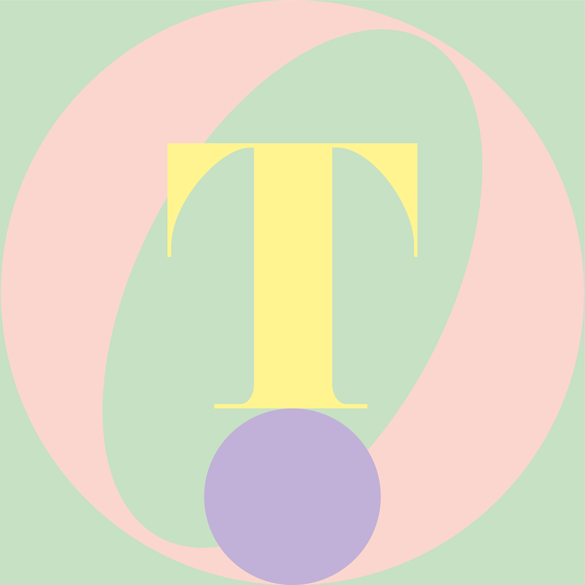
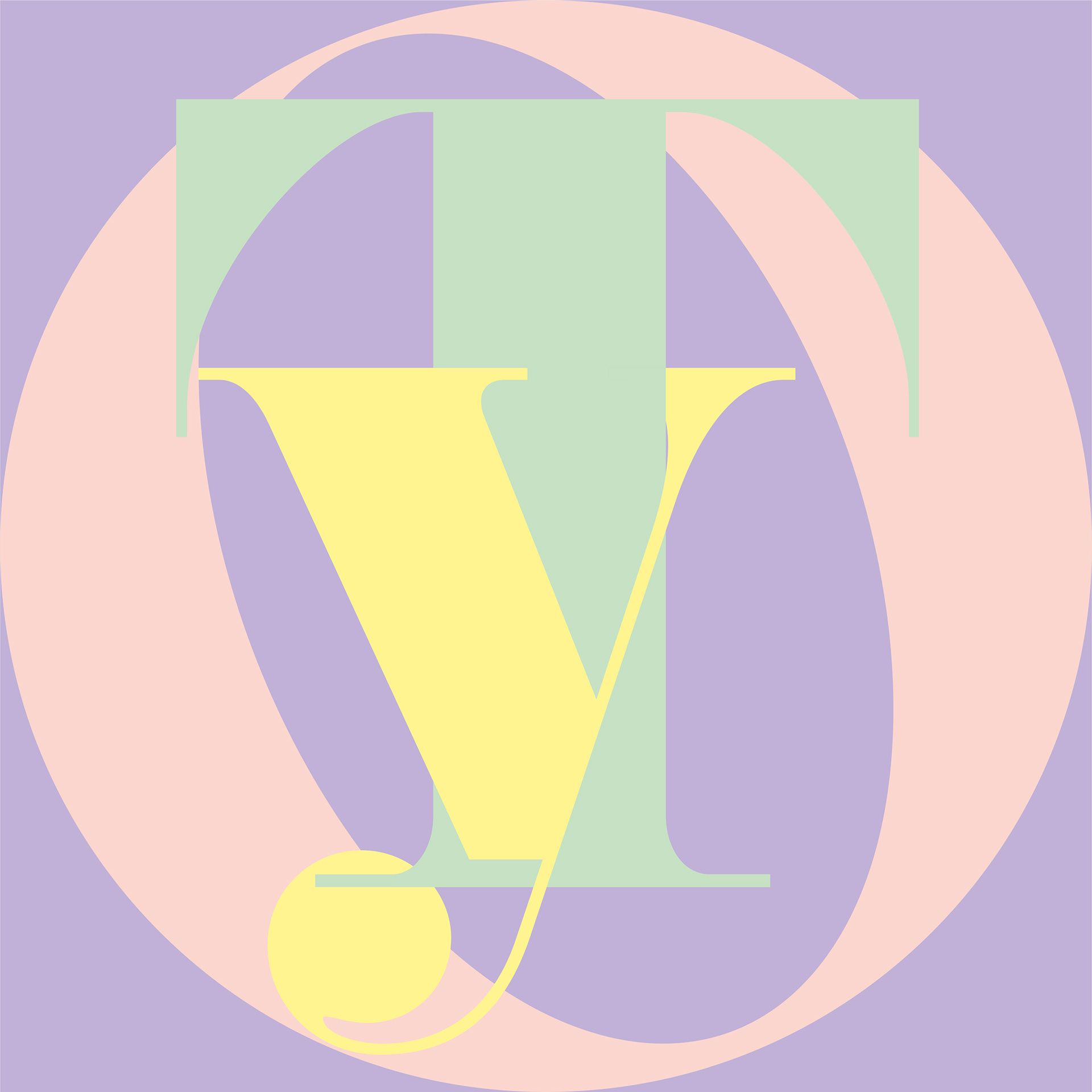
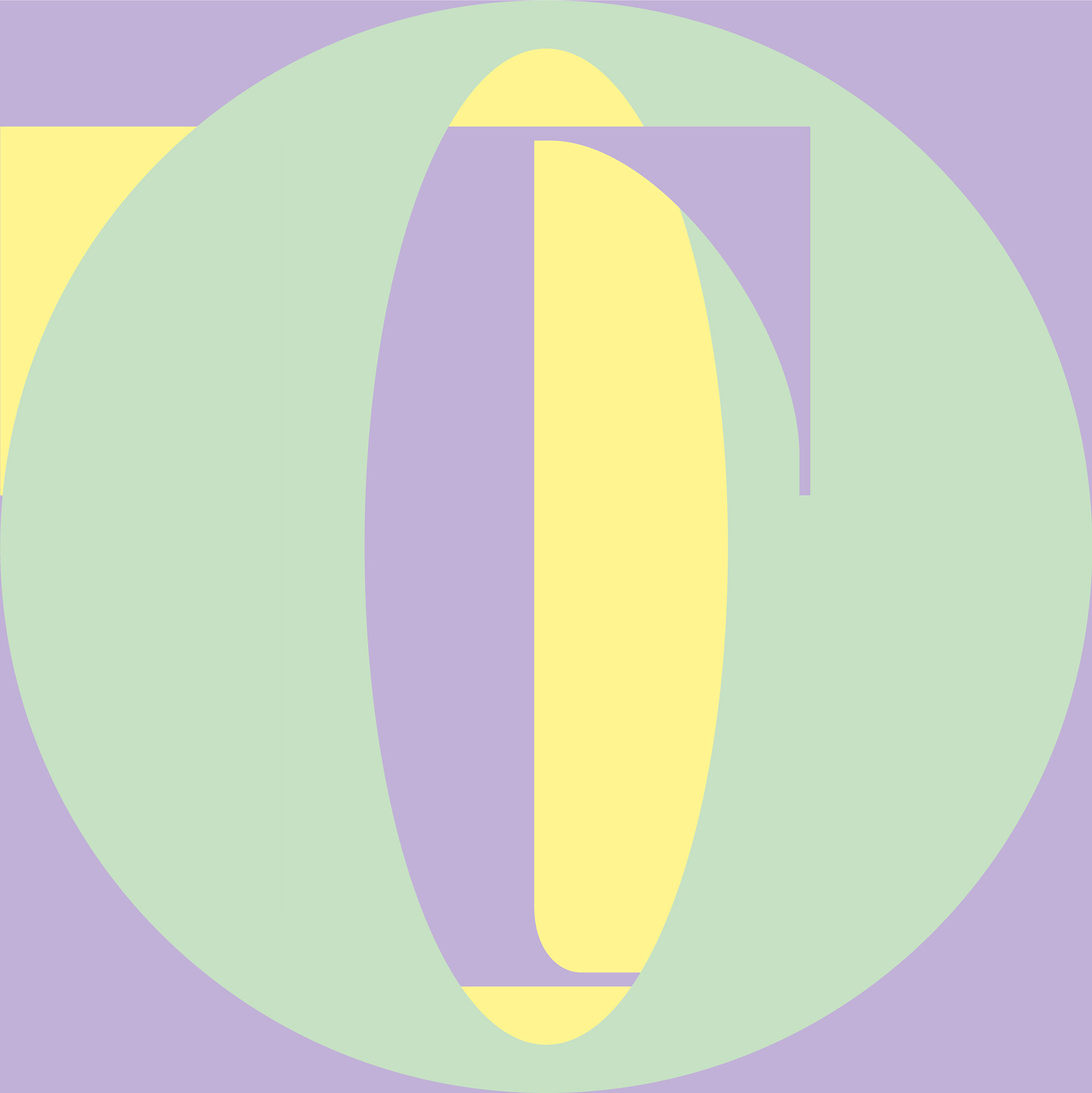
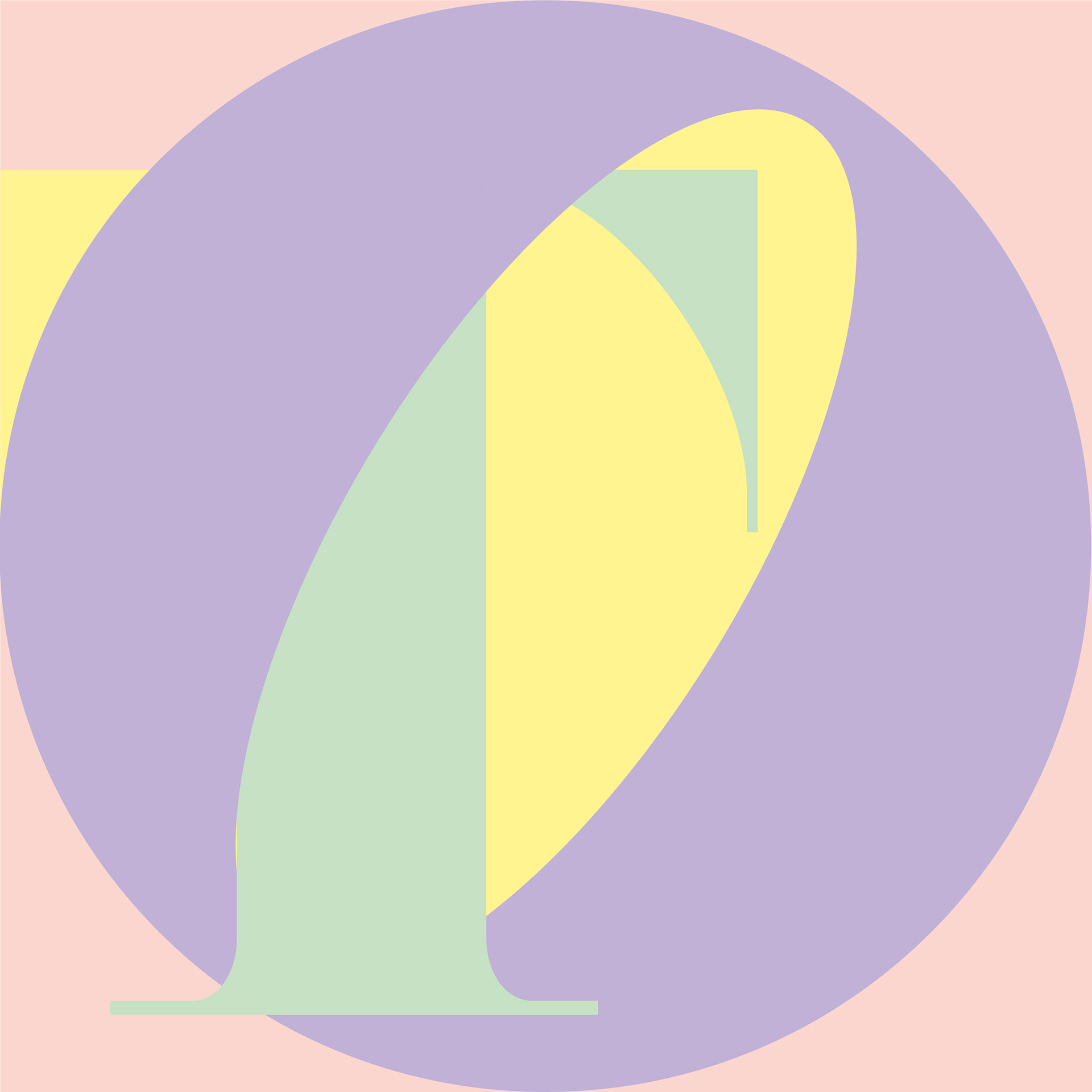
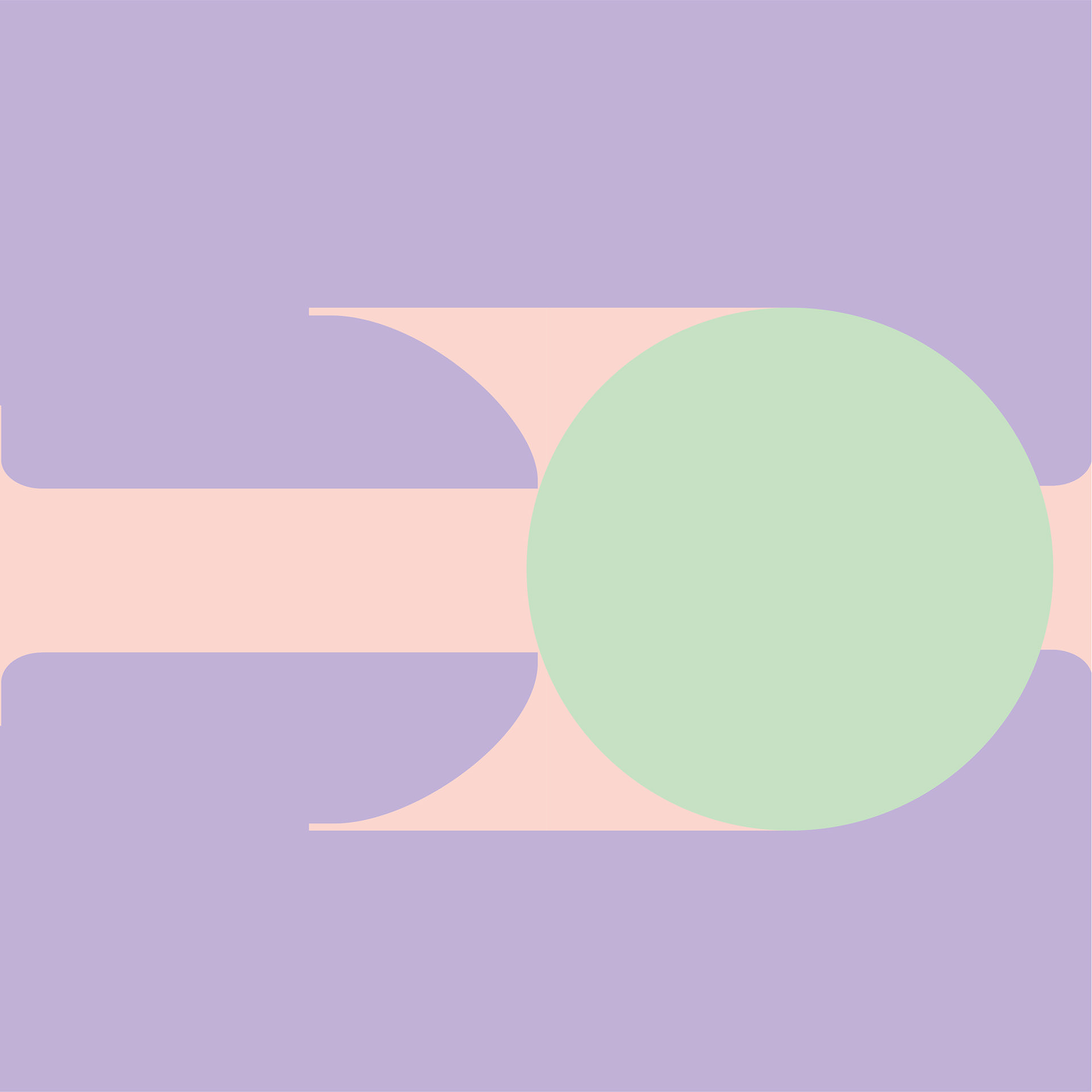
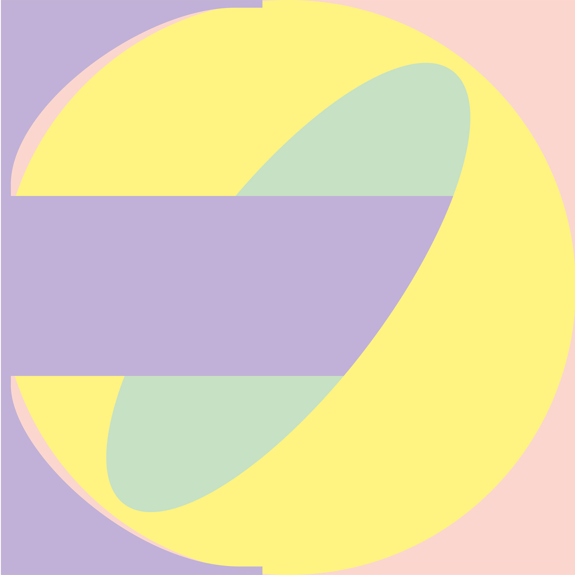
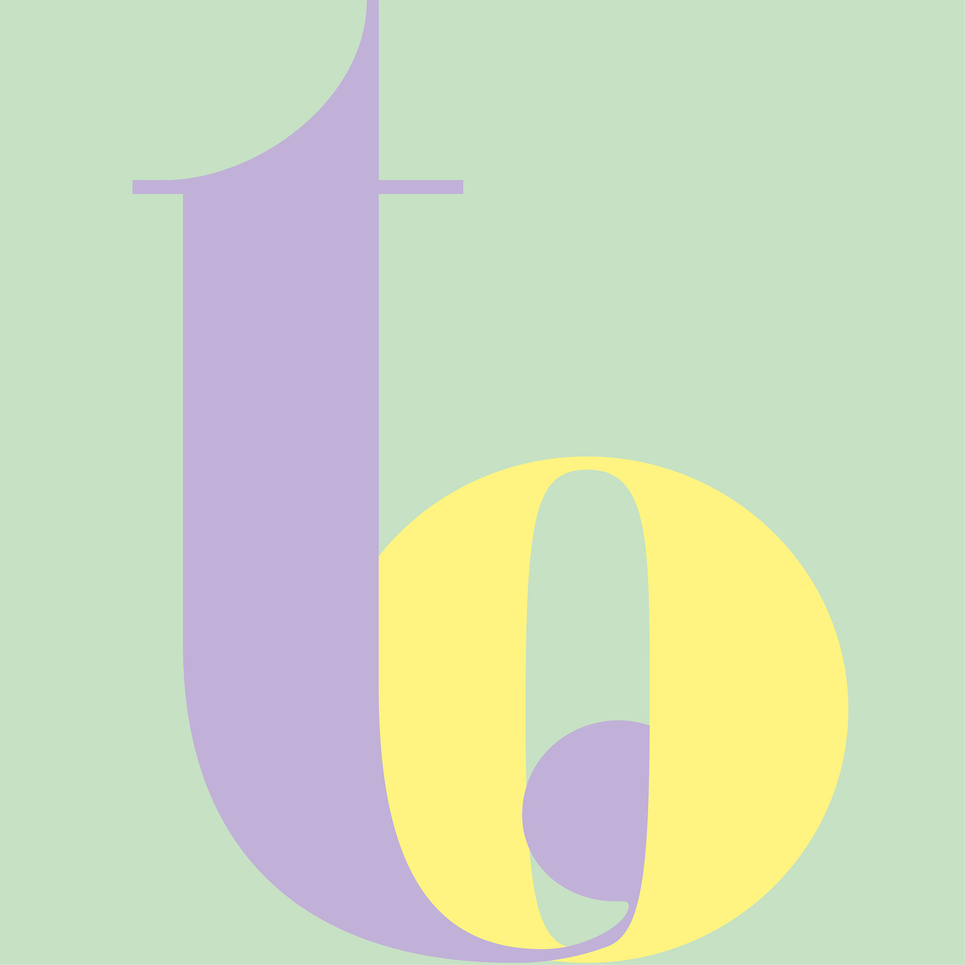
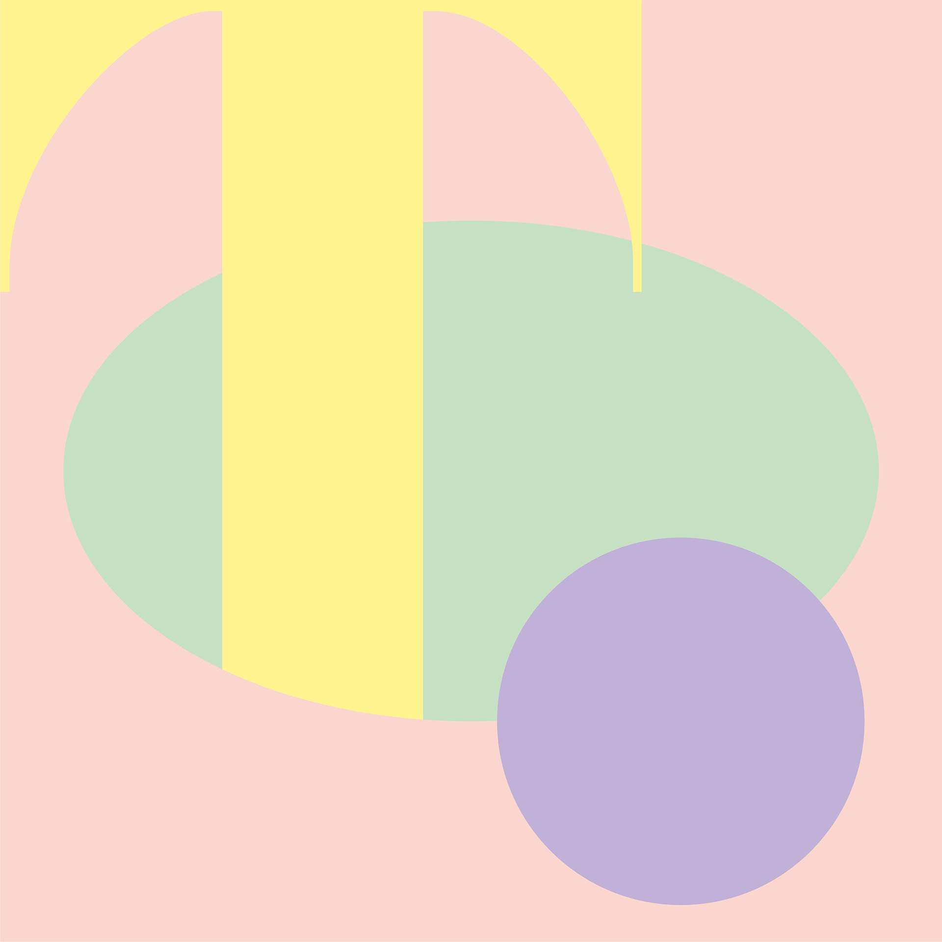
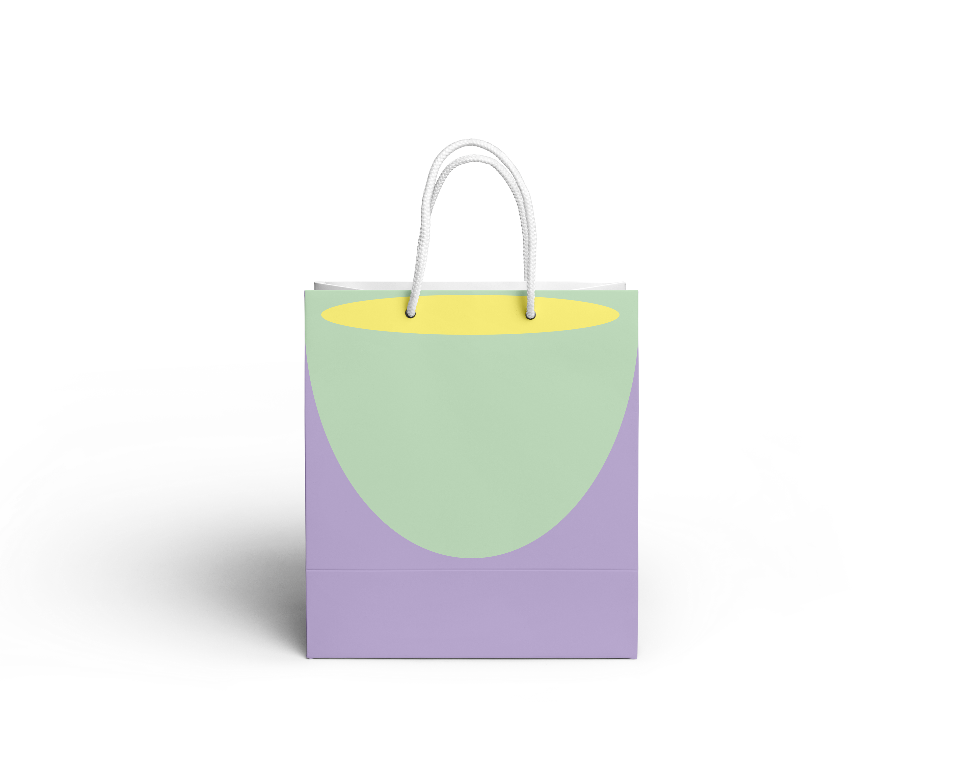
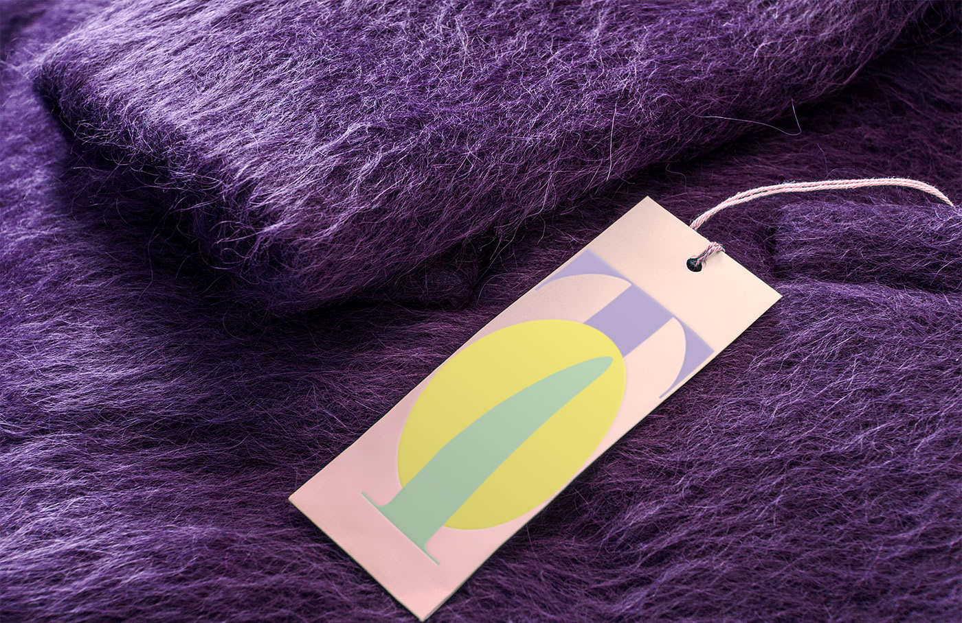
I decided to design the only type of shop, that is unimaginable to have at such location – sex shop. I selected typeface Eloquent, because of the lustful shapes and contrast in shadowing. I started to intersect letters "T" and "O" in typographic compositions, letters that together mean "IT" in Czech. Yeah, nobody wants to talk about "IT", but everyone wants it. Hence the name of the sex shop. This kind of shops should be also therefore very discreet, so the customers shouldn't be seen through the windows, nor should meet each other. So I used the compositions to make a Japanese style, translucent (but not transparent) curtains in the shop windows, that can be slid around and change into layered animation of abstract lascivious shapes. All in intimate pastel colors reminisce of skin color.
